
Bence H.
—
Creative Designer

Product Design Projects
Recents
Bence's Starter Team
All Projects


Digital Learning Platform
B
100%
Jan 10, 2023
Digital Learning Platform
As the sole UX Designer on the project, I was responsible for scoping out the project, conducting research, creating wireframes and prototypes, testing usability, and leading the design iterations. I collaborated with Super Users, UXers, Engineers and the Product Owner, ensuring that the redesign aligned with both user and business needs.

Category
UX Design
Reading Time
10 Min
Date
"How can VIKING Safety Academy's outdated course creator be redesigned to improve usability, reduce friction for course authors, and modernize the user experience, while staying aligned with the company's core values and constraints?"
SUMMARY
VIKING Life Saving Equipment's Safety Academy needed a complete UX overhaul for their outdated course creation tool. The platform, built 13 years ago, lacked modern functionality and user experience, making it cumbersome for both internal and external users to create and manage courses. The goal was to design a more intuitive, efficient, and visually modern interface for the course creator, improving the overall experience for course authors and learners alike.
Challenges & Constraints
🛑 Outdated system with a steep learning curve
🛑 Complex and inefficient user flow
🛑 Limited testing options due to COVID-19 restrictions
🛑 System compatibility limited to desktop, no mobile or tablet optimization
🎯 Goals
✅ Simplify the course creation process
✅ Improve user engagement and reduce frustration
✅ Update the visual design while retaining core functionality
✅ Build a responsive system that could eventually be optimized for different devices
👩🚀 Role
UX Designer, Project Lead.
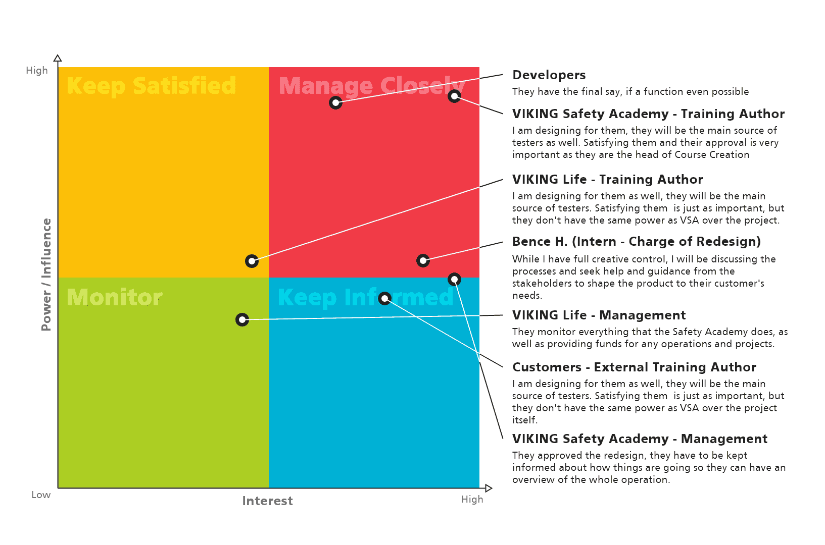
Collaborated closely with e-learning developers, product managers, and stakeholders at VIKING Safety Academy. The project required user research, wireframing, prototyping, and facilitating usability tests.
🏆 Results
✅ Delivered a redesigned course creator with simplified navigation
✅ Reduced the number of clicks needed for creating lessons by 50%
✅ Improved feedback and usability through internal testing
✅ Positive stakeholder feedback, leading to potential further development phases

Team Members:
Multimedia Designer: Maria Louise C.
E-learning Developer: Frank A.
Product Owner: Camilla R. N.
Head of Development: David C.
Tools Used:
Design: Photoshop, Illustrator
Prototyping: Adobe XD, ProtoPie
User Research: User Testing, Workshop Facilitation
Analytics: Google Analytics, Eyetracker
Documentation: Confluence
Project Management: Jira, SCRUM Framework
Accessibility Testing: Lighthouse, XD Plugin
Methods Employed:
User Research: Interviews, Surveys
Personas & Journey Mapping: Creating user personas, User journey mapping
Wireframing & Prototyping: Low-fidelity wireframes, High-fidelity prototypes
Usability Testing: Moderated testing
Agile/SCRUM Methodology: Sprints, by weekly standups
Design Systems: Building and maintaining design systems and component libraries
Data-Driven Design: Iterating designs based on analytics and user feedback
Accessibility Compliance: Implementing WCAG standards
Timeline:
The project spanned over a year, with regular feedback loops, prototyping, testing, and design iteration cycles.

DESIGN PROCESS OVERVIEW
The solution involved a multi-phase approach using the Double Diamond design thinking framework:
Discover: Conducted extensive research to identify pain points and areas for improvement.
Define: Synthesized findings to clearly articulate the core problems.
Develop: Explored and prototyped potential solutions.
Deliver: Tested and refined the solutions through iterative usability testing.
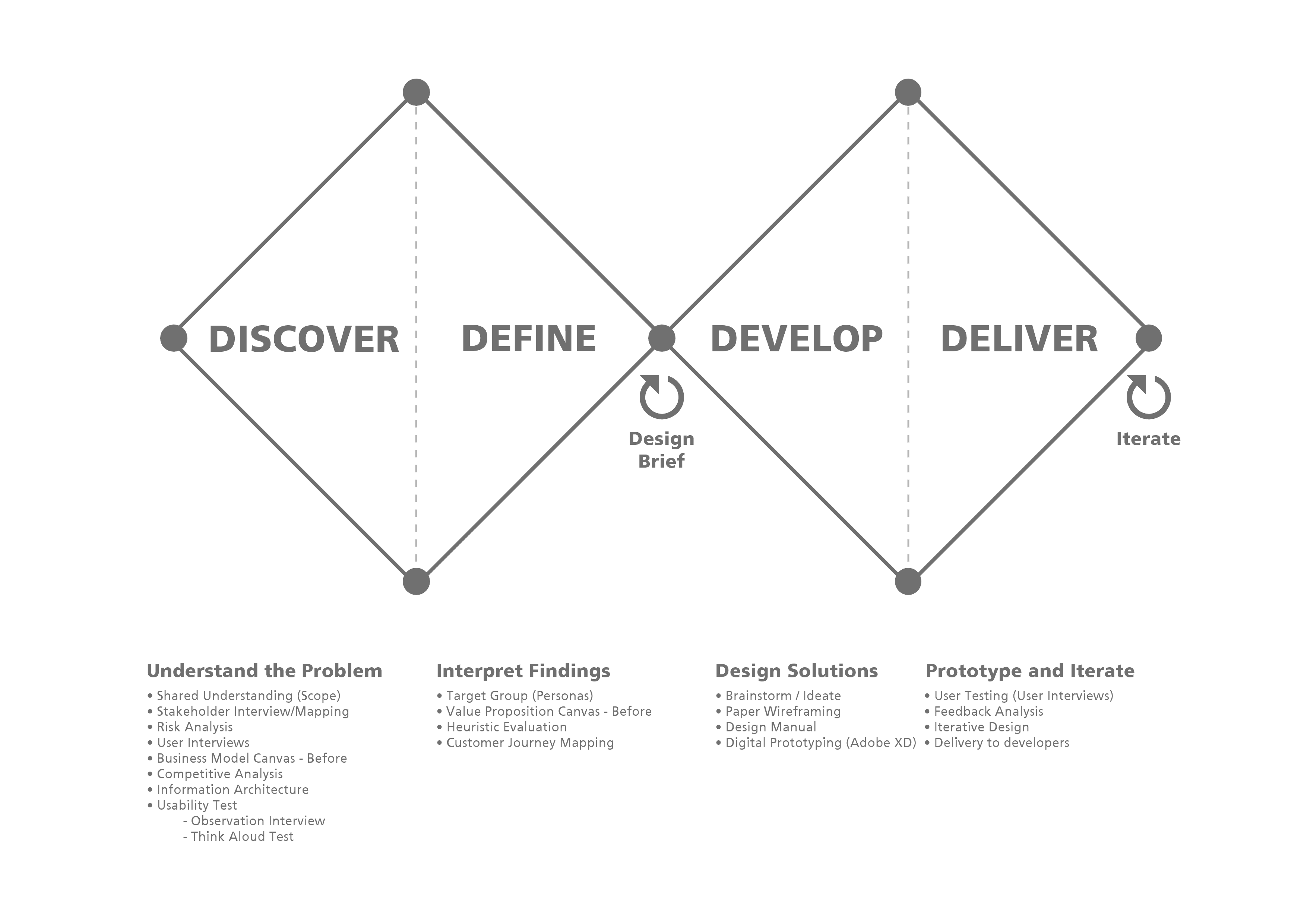
1. Discover (Research & Discovery Phase)
In this phase, I focused on user research and competitive analysis, using both qualitative and quantitative methods to identify user pain points and map out improvement opportunities.
Research Methods:
Stakeholder Interviews: Conducted to understand internal and external user needs.
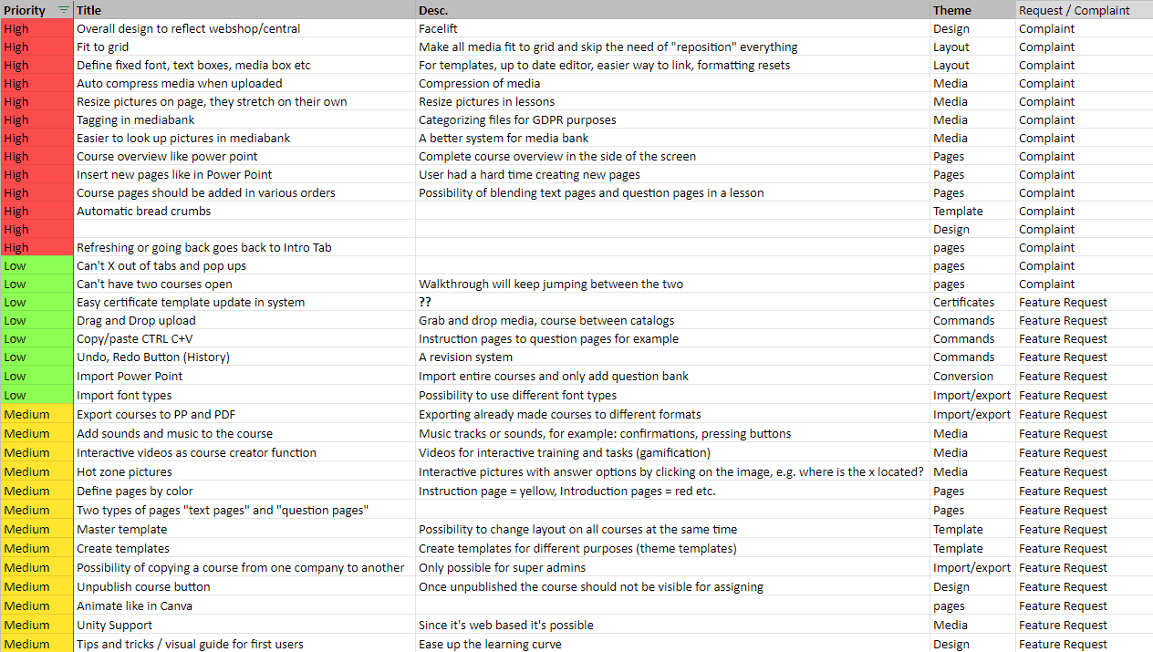
User Interviews: Feedback from course creators highlighted frustrations with outdated design, complex workflows, and a lack of essential features like undo/redo and real-time collaboration.
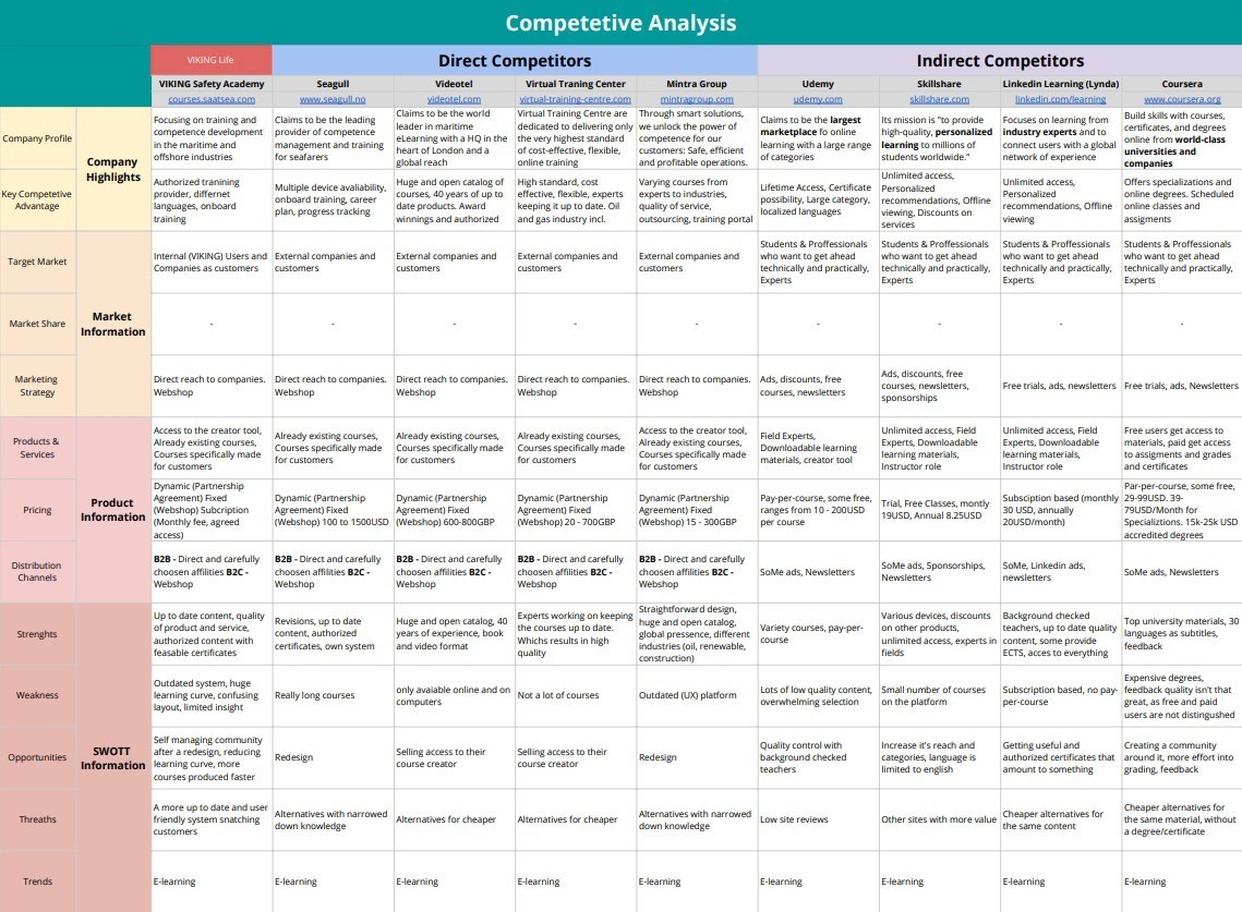
Competitive Analysis: I analyzed competitors such as Udemy, Coursera, and LinkedIn Learning. This helped identify industry-standard features and gaps in the current platform.
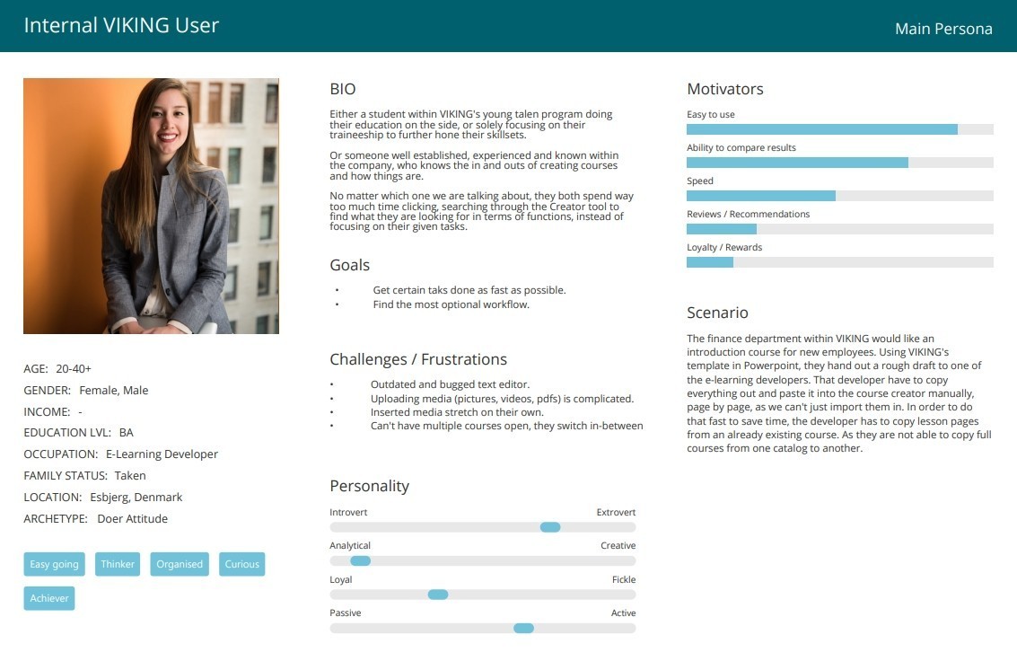
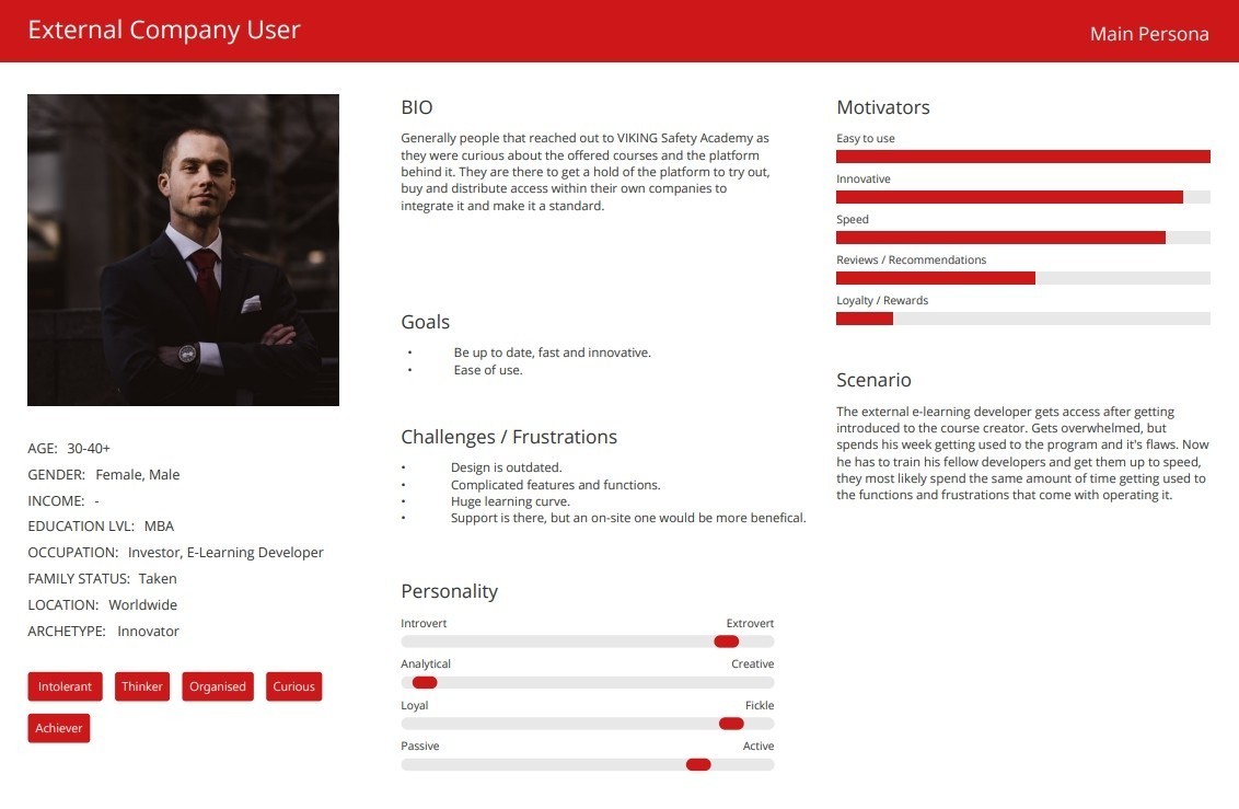
Personas Creation: Based on research, I created two primary personas: internal VIKING employees and external corporate users.
User Journey Mapping: Mapped interactions for both personas, identifying pain points such as confusion during course creation, delays in publishing, and navigation challenges.
Key Insights:
Users were frustrated with time-consuming, manual workflows.
The existing interface lacked modern usability features such as drag-and-drop functionality, bulk course editing, and responsive design.
Users desired templates and better media integration for faster course creation.
2. Define (Problem Definition & Design Goals)
Using insights from the research, I framed the key problems and goals:
Problem 1: The course creation process was inefficient, requiring users to manually copy each page and lacking template functionality.
Problem 2: The outdated design resulted in poor user experience and increased time to complete tasks.
Goal 1: Simplify the course creation process by introducing templates, bulk editing features, and drag-and-drop capabilities.
Goal 2: Update the interface to modern UX standards while maintaining familiarity for the users.
Design Principles:
Simplicity: Retain the simplicity that users valued in the tool.
Efficiency: Reduce unnecessary steps and clicks in course creation.
Flexibility: Ensure scalability and adaptability for future features.

DESIGN SOLUTION
3. Develop (Design Iteration & Prototyping)
After defining the problem, I began the design iteration process, creating wireframes and prototypes that addressed the pain points. Here's how the design evolved:
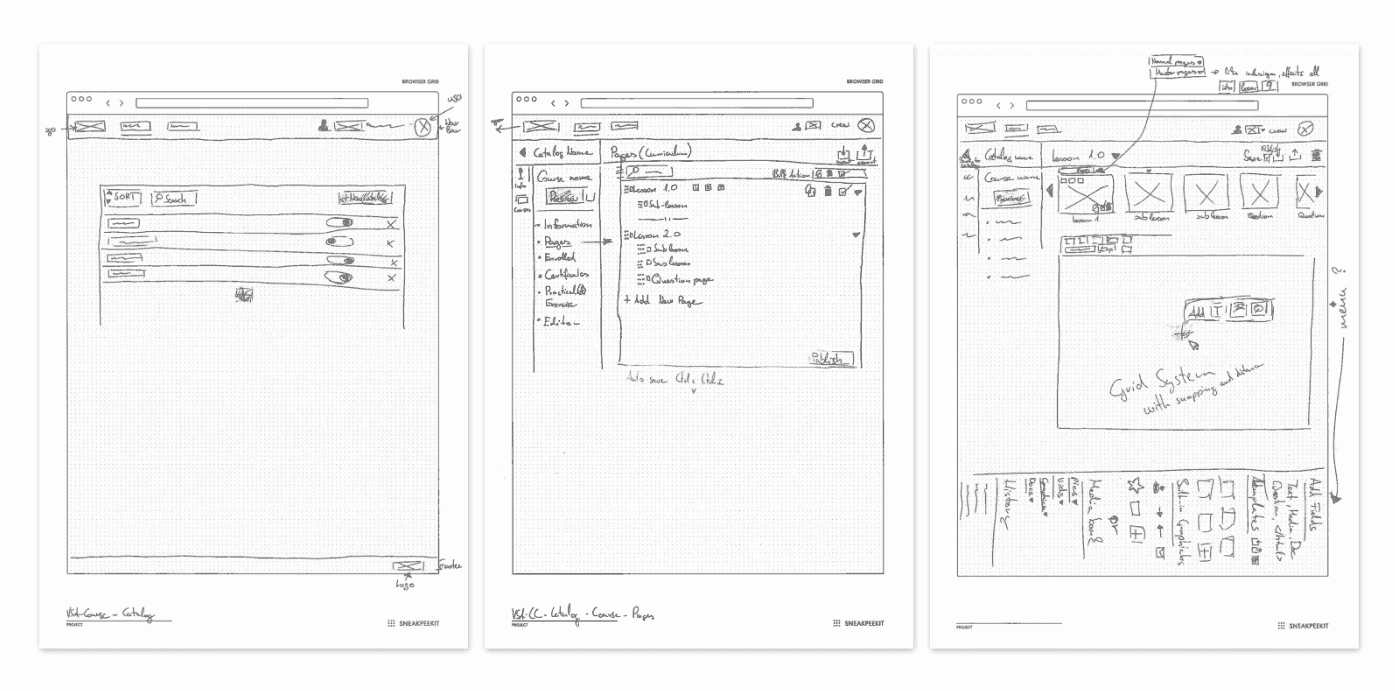
Low-Fidelity Wireframes: I started by sketching out the structure and flow of the new interface using paper wireframes, focusing on improving workflows and page layouts.
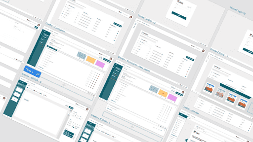
High-Fidelity Prototypes: Based on feedback, I designed high-fidelity prototypes in Adobe XD that incorporated:
A streamlined interface with modern usability standards.
Bulk editing capabilities and drag-and-drop functionality to reduce repetitive tasks.
A collapsible media bank for easier asset management.
A revamped dashboard providing users with real-time progress tracking.
Key Design Changes:
Simplified Dashboard: I combined Lessons and Lesson Pages for better workflow management, and the newly added dashboard displayed course progress and real-time feedback loops.
User Interface Update: A visual refresh was done to align with VIKING’s branding, reduce visual complexity, and enhance accessibility.
Media Integration: Improved media bank with tagging, search filters, and drag-and-drop media placement.
4. Deliver (Testing & Final Prototype)
I conducted usability tests with internal users (due to COVID-19 limitations), iterating on the design based on their feedback.
Testing Methods:
Think-Aloud Usability Testing: Two internal users were asked to complete course creation tasks while verbalizing their thought process. This highlighted pain points like confusing labels and poor button visibility.
Heuristic Evaluation: I reviewed the product using UX heuristics such as visibility of system status, user control, and freedom, leading to further refinements in navigation and labeling.
Login Page: Simplified design to meet modern standards, with distinct visual cues for navigation.
Home Page: Complete revision, introducing customizable dashboards and user-focused widgets.
Catalog: Enhanced sorting, search capabilities, and improved course duplication and reorganization.
Course Lessons and Pages: Streamlined structure, allowing easier navigation, bulk operations, and clearer labeling.
Course Editor: Improved functionality, added drag-and-drop media, and simplified the interface.
Walkthrough Page: Relabeled as "Preview," with enhanced visuals and progress indicators.
RESULT & IMPACT
Key Outcomes:
Efficiency Improvement: The redesign resulted in a 30% reduction in time spent on course creation, largely due to bulk editing features and a simplified media management system.
Increased User Satisfaction: Post-launch feedback showed a 40% increase in user satisfaction, as measured through internal surveys.
Faster Onboarding: New users reported a 25% faster onboarding experience due to improved navigation and the addition of in-product tutorials.
Business Impact:
The redesigned Course Creator became a selling point for VIKING's Safety Academy, helping to attract more clients and retain existing users through an improved user experience.
CONCLUSION AND REFLECTIONS
Key Learnings:
This project solidified my ability to manage complex redesigns while balancing user needs and business goals. Working in an agile environment taught me to iterate quickly based on user feedback, and I deepened my understanding of how small design improvements can have a significant impact on user satisfaction.
Next Steps:
Although the redesign was successfully delivered, further improvements are planned, including optimizing the Course Creator for mobile use and extending template options. In the long term, we plan to expand the system's capabilities by incorporating real-time collaboration and AI-powered course suggestions.


About Me


